Saturday, December 14, 2013

'Tis the Season to Get That Camera Out of Auto Mode


If you're like me and leave your camera in auto mode more often than not, now is a great time to do a little experimenting.  (Don't get me wrong.  I'm not knocking auto mode.  For the most part it does a great job, but there are definitely times to take advantage of some of your cameras other features.)

These shots were taken at night, hand held with only the tree lights and one table lamp on in the room.  Both shots are shown as they came straight out of the camera - no editing.  I can hold a camera pretty steady, but in the dim light with auto mode I came away with the shot on the left.  I then went to "Scene" mode and chose "Hand-held Twilight".  In this mode the shutter fires off quickly several times and then combines them into one shot.  You can definitely see the difference.  (My camera is a Sony Nex-5N, so yours may have the same or similar feature but call it something else.  My little point & shoot Canon has something called "Hand-held NightScene" which basically does the same thing.)

I included a snippet from the same area of the tree from each shot, so you can really see the difference close up.

So now with some minor editing (slight levels & brightness adjustments and lightened the shadows just a bit), I've got a shot I'm pretty happy with.

If you've got a photo of holiday lights you'd like to share, please feel free to leave a link in the comments. Your tips are also welcome.

Enjoy the season and capturing those special moments!

Friday, December 6, 2013

Using Poster Edges for Definition


Here's a quick tip using one of my favorite PSE filters...  and by favorite I mean I use it quite frequently - but only in moderation.  I haven't yet found a use for it in it's full blown 'go-for-it' mode, although please consider that a challenge if you like.  

On the left is a section of my original photograph as it came out of the camera.  On the right is an example showing the defined edges for a crisper look.  (We could debate as to whether or not that's a desirable look for this particular photo, but let's just assume that's the look we're going for.)  So find a good image of your own that feels like it might just need a little extra 'punch' and we'll go through the steps...

Obviously if you've been reading my previous posts, you are working from a copy and before you make any modifications to the copy, you've made a duplicate background layer.  No? Go ahead and refer back to the November posts.  I'm not going anywhere! ;)  Also please note that if your image needs any basic adjustments you'll probably want to take care of those first.  For instance you might want to do your levels adjustment.  Once you're happy with your adjustments go ahead and flatten the image ("Layer" - "Flatten Image") and then make a duplicate layer of your now enhanced image.  OK, let go...

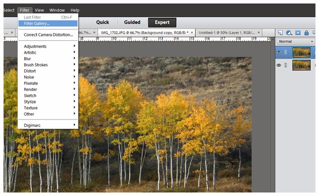
This is super simple and can really add a lot to the right photograph.  Making sure you have your duplicate background layer highlighted (the one on top), go to "Filter" in the menu bar and then select "Filter Gallery".

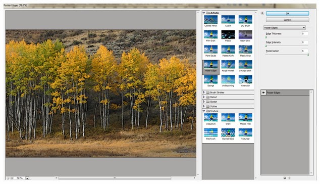
Elements will open up a new screen for the "filter gallery".  You'll have lots of choices to play with here, but for now pick "Poster Edges" under "Artistic".

Once you select "Poster Edges" you'll see that it gives you some options off to the right. Even though I have "Edge Thickness" and "Edge Intensity" set at "0", it will still give me a bit of an edge.  Play around and move all 3 sliders back and forth to see what it does to your image.  Quite honestly, this "0-0-6" configuration is what I most often use, occasionally pushing out of my comfort zone with a big, scary "1" for either thickness or intensity. 

You have the eyeball icon here, just like on the layers panel.  Works the same way - click on, click off to see your image with or without the filter you've applied.

This would probably be a good time to mention that the size/resolution of your image will have a big impact on the effect your get when applying any of the artistic photo filters .  If you're working with a large file at 300 dpi, you're going to see far less impact than if you've working with a smaller file at 72 dpi.  I recommend that you make all of your adjustments on a larger file, which can then be sized down after you've tweaked it to your liking and flattened the file. (Let's say you start going crazy on a small file and then decide you've created a masterpiece, which you're now thinking might make kind of a cool poster size print... well guess again.)

So off my soapbox and back to the task at hand...  You've now tweaked the "Poster Edges" settings to your liking or something close.  Go ahead and hit "OK".  The gallery will close and put you back on your main PSE screen with your newly modified image.

Since your artistic filter has only been applied to your top layer, if you decide it's a little strong you can grab the "Opacity" bar (just like we did when adjusting levels).  Dial it down a bit and some of your original image will start to show through, lessening the effect of the "Poster Edges".

That's it!  Sometimes you won't like the effect at all.  (Remember "Undo" is probably the most used tool in our 'Beginner's Toolbox'.)  There are times I find it does the trick, especially if my shot just isn't quite as sharp as I'd wanted.  In the image above I happen to like the way it adds to the detail of the tree bark and gives some definition to the leaves.

How or if you use it is all a matter of personal preference.  But it's an option and one you might find useful at times.

Tuesday, November 19, 2013

Photographing Food.. How to do it better...

Some of you know that I like snapping pictures of food, but I've only done it as a very quick & casual thing. I thought I'd share Brooke McLay's SmugMug site with some great examples of what a pro is capable of. She's a food photographer and recipe developer and I'm definitely going to be spending some time studying her photos.

 
One of my favorite shots from her page.  Talk about natural lighting!  How cool is this?
Outdoor shot, taken from below with the cucumbers floating on top.  Love it!!


And I thought I was being kind of professional, artsy-fartsy by keeping the kitchen clutter out of the shots and sometimes shooting at a bit of an angle. (Hey it smells good & I want to get on with eating it!) But I can definitely see that I've got room for improvement, particularly with the lighting. 


Here is a nice SmugMug tip sheet where Brooke fills us in on just how she gets these great shots of hers. While she is definitely a pro and goes to great lengths to setup her shoot, I'm lucky to whip together a dish that even looks worthy of a shot.  So I most likely won't be traipsing off to the lumberyard for just the right backdrop. Though perhaps I'll start putting forth a bit more effort, rather than simply clearing some counter space with a quick shove of my arm.  Thanks for the tips Brooke!

Sunday, November 17, 2013

PSE Levels Adjustments

In the last post we're assuming we've had some beautiful results with the "Auto" levels tool. Now I'll show you what I do when I'm not so happy with "Auto".  (I should mention here: I had to pull up quite a few different shots before I could find a couple that "Auto" didn't do the trick on.  Pretty good indicator that Elements is getting smarter with each new version.)

So just for drill...  You've got an image up that is a COPY of your original and you've created a duplicate background layer.  If you're reading this and going "Huh?", please go back and look at the previous 2 posts.

This is my original untouched image.  Remembering to make sure your copy layer is selected, go to Enhance-Adjust Lighting-Levels or use the shortcut Ctrl-L.


This is the result I got with "Auto".  There is absolutely nothing wrong, if this vivid look was what I was going for, but I liked the softer feel of the original.  I just want to improve it by eliminating that gray hazy look. But I go ahead with "Auto" and say "OK".


Now look at the layers panel.  You can adjust the opacity of the layer that you just altered. Slide it back and forth and see how your image changes. Basically this layer is sitting on top of your original and the further you slide the percentage down, the more your original is showing through.


For this image I backed it off to 38%, retaining some of the softer look of the background layer, but giving it a bit of punch with the new adjusted layer.  So that's one way to adjust levels.


Now I've got an image of Betsy (one of our Buff Orpingtons) and it's pretty dark and dingy looking. I'm going to try "Auto" again because I pretty much always try "Auto" -- it just doesn't always do the trick.


Yikes!  It's no longer dingy, but it also blew all the warmth right out of the picture. When you absolutely hate what it does to your image, just hit "Reset" and we'll try it a different way.


Now instead of "Auto" just use your mouse to grab the little sliders on the left & right of the "Input Levels" chart.  General rule of thumb here is that you want to bring them in just to where your "mountain range" starts.  So for this image I barely moved the one on the left and then pulled the one from the right in to where the graph just starts to rise.  Voila!

Whether or not you agree with the outcome of my images, the point here is to show you the tools.  Obviously the final product is going to be a matter of personal preference.  That's what makes it unique and makes it yours.  Play around with it, go wild!!  After all, your original is stashed away someplace safe -preferably in 2 safe places.  No? Better see my post: BACK IT UP! 

Wednesday, November 13, 2013

My Version of the "Basics of Editing" - Part II

So on the last post we got to the point where we have one (duplicated / non-original) image up on the screen and have created a duplicate background layer. 

For the purpose of this demonstration I've grabbed a different image that is a more typical landscape shot.


So the way I work is that I'm going to leave my background layer alone and do all of my editing with layers on the top of it.  This will make more sense as we go along, but for now just make sure you've clicked on the copy layer and that it's highlighted.


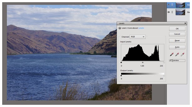
Probably 99.9% of the time the first edit I make (or at least look at) is "Levels".  Most digital images have a bit of a grayish haze in them.  It varies depending on the lighting conditions the photo was taken in and sometimes with perfect conditions you may not get it at all.  But most often it's there to some degree and you may not even realize it until you take a gander at the "Levels" tool...  So go to "Enhance", "Adjust Lighting" and "Levels".  As you can see from the screen shot above CTRL+L is the shortcut if you'd rather use that.


You'll then get the Levels box with lots of options, but for now we're going to keep it simple.  Just make sure the "Channel" has defaulted to "RGB" and that the "Preview" box is checked.


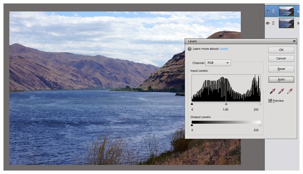
In some of the older versions of PSE  "Auto" would destroy the look of your photo more often than not.  However the later versions are smarter and I find that quite often "Auto" is bang on.  So give it a click and see what happens.  I'm quite happy with what it did for this image and for the sake of this exercise I'm going to hope that you had similar results.  It's a subtle difference but hopefully you can see that it has cleared, brightened and just given a bit more definition to the shot.  Regardless of the outcome of your photo, go ahead and click "OK" - just for the sake of the exercise.  You can always go to "Edit" - "Undo" later!


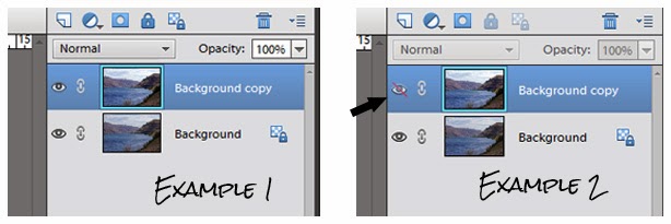
Now take a look at your layers panel.  You see the little eyeball is open on both layers in the first example.  If you click on the background copy's eyeball (example 2) it will shade the eyeball and draw a slash through it, making that layer invisible. So click on, click off --  easy quick way to compare the before and after of that particular edit.  You'll really see the value in this when we start building multiple layers.

This time I'm happy with "Auto", but there will be lots of times it just doesn't quite do the trick or doesn't even come close.  So surprise, surprise... next up we'll tackle "Levels Adjustments".