Tuesday, November 19, 2013

Photographing Food.. How to do it better...

Some of you know that I like snapping pictures of food, but I've only done it as a very quick & casual thing. I thought I'd share Brooke McLay's SmugMug site with some great examples of what a pro is capable of. She's a food photographer and recipe developer and I'm definitely going to be spending some time studying her photos.

 
One of my favorite shots from her page.  Talk about natural lighting!  How cool is this?
Outdoor shot, taken from below with the cucumbers floating on top.  Love it!!


And I thought I was being kind of professional, artsy-fartsy by keeping the kitchen clutter out of the shots and sometimes shooting at a bit of an angle. (Hey it smells good & I want to get on with eating it!) But I can definitely see that I've got room for improvement, particularly with the lighting. 


Here is a nice SmugMug tip sheet where Brooke fills us in on just how she gets these great shots of hers. While she is definitely a pro and goes to great lengths to setup her shoot, I'm lucky to whip together a dish that even looks worthy of a shot.  So I most likely won't be traipsing off to the lumberyard for just the right backdrop. Though perhaps I'll start putting forth a bit more effort, rather than simply clearing some counter space with a quick shove of my arm.  Thanks for the tips Brooke!

Sunday, November 17, 2013

PSE Levels Adjustments

In the last post we're assuming we've had some beautiful results with the "Auto" levels tool. Now I'll show you what I do when I'm not so happy with "Auto".  (I should mention here: I had to pull up quite a few different shots before I could find a couple that "Auto" didn't do the trick on.  Pretty good indicator that Elements is getting smarter with each new version.)

So just for drill...  You've got an image up that is a COPY of your original and you've created a duplicate background layer.  If you're reading this and going "Huh?", please go back and look at the previous 2 posts.

This is my original untouched image.  Remembering to make sure your copy layer is selected, go to Enhance-Adjust Lighting-Levels or use the shortcut Ctrl-L.


This is the result I got with "Auto".  There is absolutely nothing wrong, if this vivid look was what I was going for, but I liked the softer feel of the original.  I just want to improve it by eliminating that gray hazy look. But I go ahead with "Auto" and say "OK".


Now look at the layers panel.  You can adjust the opacity of the layer that you just altered. Slide it back and forth and see how your image changes. Basically this layer is sitting on top of your original and the further you slide the percentage down, the more your original is showing through.


For this image I backed it off to 38%, retaining some of the softer look of the background layer, but giving it a bit of punch with the new adjusted layer.  So that's one way to adjust levels.


Now I've got an image of Betsy (one of our Buff Orpingtons) and it's pretty dark and dingy looking. I'm going to try "Auto" again because I pretty much always try "Auto" -- it just doesn't always do the trick.


Yikes!  It's no longer dingy, but it also blew all the warmth right out of the picture. When you absolutely hate what it does to your image, just hit "Reset" and we'll try it a different way.


Now instead of "Auto" just use your mouse to grab the little sliders on the left & right of the "Input Levels" chart.  General rule of thumb here is that you want to bring them in just to where your "mountain range" starts.  So for this image I barely moved the one on the left and then pulled the one from the right in to where the graph just starts to rise.  Voila!

Whether or not you agree with the outcome of my images, the point here is to show you the tools.  Obviously the final product is going to be a matter of personal preference.  That's what makes it unique and makes it yours.  Play around with it, go wild!!  After all, your original is stashed away someplace safe -preferably in 2 safe places.  No? Better see my post: BACK IT UP! 

Wednesday, November 13, 2013

My Version of the "Basics of Editing" - Part II

So on the last post we got to the point where we have one (duplicated / non-original) image up on the screen and have created a duplicate background layer. 

For the purpose of this demonstration I've grabbed a different image that is a more typical landscape shot.


So the way I work is that I'm going to leave my background layer alone and do all of my editing with layers on the top of it.  This will make more sense as we go along, but for now just make sure you've clicked on the copy layer and that it's highlighted.


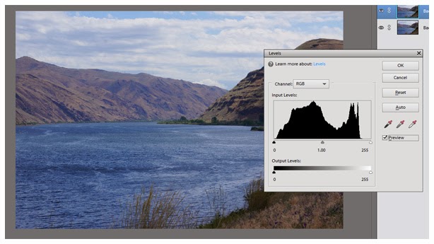
Probably 99.9% of the time the first edit I make (or at least look at) is "Levels".  Most digital images have a bit of a grayish haze in them.  It varies depending on the lighting conditions the photo was taken in and sometimes with perfect conditions you may not get it at all.  But most often it's there to some degree and you may not even realize it until you take a gander at the "Levels" tool...  So go to "Enhance", "Adjust Lighting" and "Levels".  As you can see from the screen shot above CTRL+L is the shortcut if you'd rather use that.


You'll then get the Levels box with lots of options, but for now we're going to keep it simple.  Just make sure the "Channel" has defaulted to "RGB" and that the "Preview" box is checked.


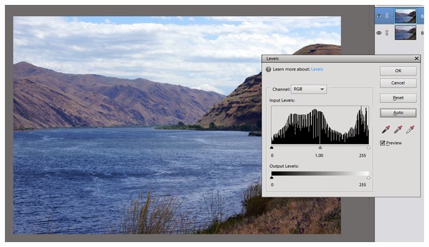
In some of the older versions of PSE  "Auto" would destroy the look of your photo more often than not.  However the later versions are smarter and I find that quite often "Auto" is bang on.  So give it a click and see what happens.  I'm quite happy with what it did for this image and for the sake of this exercise I'm going to hope that you had similar results.  It's a subtle difference but hopefully you can see that it has cleared, brightened and just given a bit more definition to the shot.  Regardless of the outcome of your photo, go ahead and click "OK" - just for the sake of the exercise.  You can always go to "Edit" - "Undo" later!


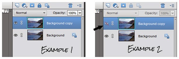
Now take a look at your layers panel.  You see the little eyeball is open on both layers in the first example.  If you click on the background copy's eyeball (example 2) it will shade the eyeball and draw a slash through it, making that layer invisible. So click on, click off --  easy quick way to compare the before and after of that particular edit.  You'll really see the value in this when we start building multiple layers.

This time I'm happy with "Auto", but there will be lots of times it just doesn't quite do the trick or doesn't even come close.  So surprise, surprise... next up we'll tackle "Levels Adjustments".

Monday, November 11, 2013

My Version of the "Basics of Editing" - Part I

To date, I do all of my editing with Photoshop Elements.  I'm currently on version 11, but if you're working with a previous or a newer version, this should all work pretty much the same.  In this post I'm going to cover the very first steps that I do each and every time.


Before we get started let me point out that I always work in "Expert" mode (across the top). Not because I'm an expert (by any means), but because "Quick" has only the very basics, which are also in "Expert" and I see no reason to waste time flipping from one to the other. (There are some fun things in the "Guided" section that we'll explore another time.)


So the very first thing I do once I open an image, is go to "File" and then "Duplicate".  The reason for this is you NEVER want to alter your original image. ALWAYS work from a copy and keep the original safe for future use if needed.


You'll then get a screen asking you to name the new image.  Once you've named it and hit "OK", you should close your original.  Yes, just get it off the screen before you confuse the two and end up altering them both (And yep, I learned this lesson the hard way!).


Next we're going to take it one step further.  From your layers panel (to the right of your screen & if it's not showing you may have to select it), take your mouse, grab your background layer and drag it up (or down in some of the previous versions) to the "create a new layer" symbol.  


You should now have a screen that looks something like this.  Only one image opened, with two identical layers in the panel.

It is now past my bedtime and I might turn into a toad.  Part II coming up - hopefully tomorrow.

Thursday, November 7, 2013

BACK IT UP!!!

... and yes, I am screaming this or at least speaking in a very stern voice...

Some years back I had a brand spank'n new computer seize up on me only a couple of months out of the box.  I was able to ship it back to the factory and had it returned to me in tip-top shape, but I lost all the data - including my pictures.  Luckily all of my older photos were backed up on discs, but I lost everything I had taken for those 2 or 3 months.

(For those of you wondering... Yes, I would rather have a Mac but it's just
not in the budget.  Plus my newer HP is performing like a champ!)

Lesson learned.  Since that time I never clear my camera card until I have my images downloaded in 2 places.  After deleting the obvious 'flubs', I download to my computer and only after I pull those same files over to my external hard drive, do I format my SD card.

Don't say I didn't warn you!