We've all received that photo in an email where a huge, hairy nostril (or some such thing) is staring back at us. Very irritating. Worse yet, are you the guilty party who might be sending these gargantuan files?
Today's cameras are capable of giving us wonderfully, huge images which are great for printing. However any image that you plan to show on the screen, be it email or posting on a website, can be reduced to a fraction of the original file size and still show beautifully. The human eye will never know the difference and it will also load in a fraction of the time.
I've been resizing images
forever and it really hadn't occurred to me to do a "How To" on the subject. However thinking back, this is probably the number one thing people have asked me to show them. Pretty basic stuff, but if you're new to photo editing it's definitely something you need to know.
If you've read my previous posts you know that I'm using Photoshop Elements and that I never, never, never recommend altering your original image. The first thing I
always do after opening an image in Elements is go to "File" - "Duplicate". Then close and put your original away for safe keeping. OK, so now you've got a full size, duplicated image on your screen. Let's get started...
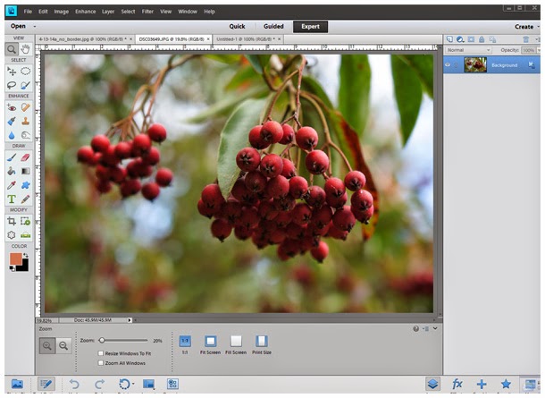
Above is my original (duplicated) image straight out of the camera. It's a 2.87 MB file measuring 4912 x 3264 pixels - or roughly a 14 x 9" image at 350 ppi (pixels per inch). Note -it's not legible in the above screen shot, but in the snippet below you can see that in order to fit the entire image in my work area it automatically opened at less than 20% (right above where the "image size" dialog box is). More on this later.
The fact that it's 350 ppi means that it is going to be MUCH larger on the screen than the 14 x 9" since screen resolution is more along the lines of 72 or 96 ppi.
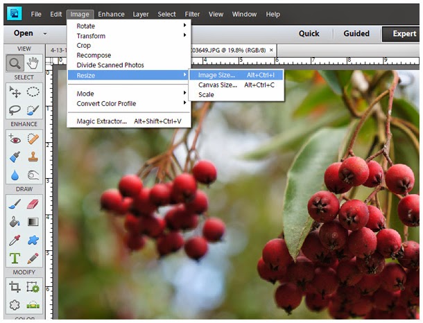
Now go to "Image", select "Resize" and then "Image Size".
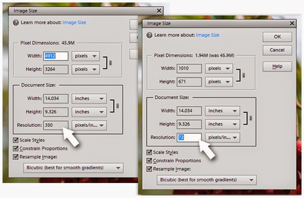
On the left is the dialog box that opens showing my current file information. Make sure that all 3 check boxes are checked. Then on the right you can see what happens when changing the resolution from 350 to 72 (standard resolution for website viewing). The width & height have been reduced drastically as it pertains to pixels, yet our actual document size in inches remains the same. In other words, we have just reduced the file size dramatically, but you've now got an image that will display correctly at approximately 14 x 9" (or whatever your original started out as). This is still a pretty big image for most purposes, so you may want to take it a step further.
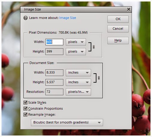
Keeping all the boxes checked, go up to the pixel dimensions. Since we have "Constrain Proportions" checked, it will only be necessary to change either the width or the height. The other will adjust automatically. At 72 ppi, a width of 600 px's gives us an image that will display at approximately 8 x 5". Or you may want to go 800 px's wide or whatever. My point being that something in this range is a much more manageable size to send via email, especially if you're sending multiple images. It's also plenty big for posting to facebook*, etc. So decide on a size and hit "OK".
*If you're a facebook junkie, please read the comments section at the bottom of this post for an update to this info.
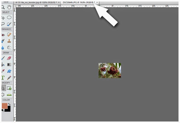
And WHOOPS! You now see a tiny, barely recognizable, little image. Before you start cursing at me, note that Elements is still displaying your image at less than 20%. This pretty well illustrates just how much you have reduced the file size. To now see your image at the true size you have reduced it to, simply grab your zoom tool and increase the image to 100%.
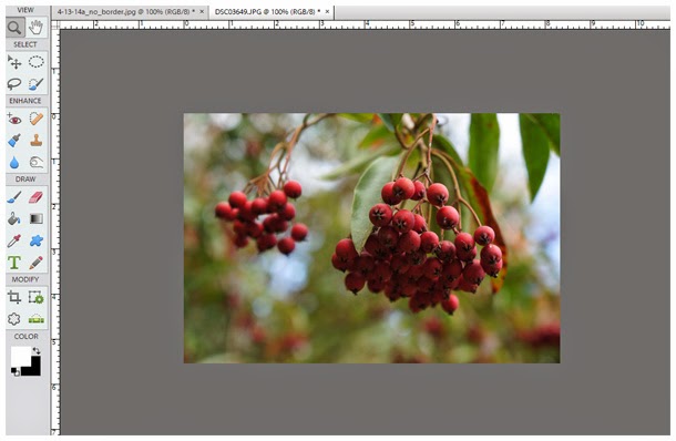
Voila! At 100% my image is now displaying on the screen at that approximate size of 8 x 5" that I had chose. It's worth noting here that once your image is displayed on the web, the size will appear slightly different on different monitors. This is due to the fact that monitors come in and can be set at different resolutions. Not to worry - regardless you now have an image that is not obnoxiously large.
Now rather than doing a "File" - "Save" or "Save As", I select "File" - "Save for Web".
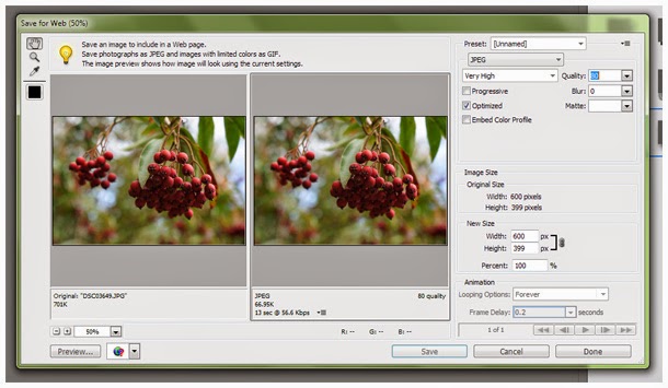
The above dialog box will open giving you the option to set the quality. I find that a JPEG set at anything around 80% or above is excellent. This "Save for Web" step further optimizes your image for the web and removes some of the file information. The viewing dimensions remain the same, but your file size has been reduced even further, making loading just that much faster.
Whew! For something I consider pretty basic information, this just might be my longest post yet - and I still don't know that I've explained it all that well. If you've got any questions please leave them via a comment and I'll do my best to respond.